Edward Bawden who best known for his prints, books and posters, who became an war artist along with his friend Eric Ravilious who were taught by another war artist Paul Nash who's brother John Nash was also a war artist, at the Royal College of Art. Bawden who worked in different mediums, illustration, graphics, where he was known to be a painter and print maker, who taught at Goldsmiths and the Royal College of Art. Bawden was also part of the Great Bardfield artists movement, which was a series of artist that lived in the Great Bardfield village during the 20th century.
Some of Bawden paintings/illustrations during his time as an war time artist can be found at the imperial war museum, In an Air Raid Shelter, Dunkirk Bombs are dropping, a watercolour painting of the inside of an air raid shelter, which pictures wounded soldiers taking cover.
Bawden's work can also be found in the Tate collection Cairo, the Citadel: Mohammed Ali Mosque, Eric Ravilious, Paul Nash and John Nash's work can be related to Bawden's work, where some of the themes, basic ideas and environments are the same, where they produced paintings of events which took place during the second world war, where they were all war artist, Louis Wain's work can also be related to Bawden's cat pictures, where Bawden took inspiration for Wain's cats images, which inspirited his own.
Edward Bawden as a child began studying drawing of cats by Louis Wain, where he would create his very own cat prints, he also studied Brune Jones's illustrations, Bawden took an interest in calligraphy and the work of Aubrey Beardsley, Richard Doyle, William Morris, along side other Victorian artist during that era.
In 1922 be studied Illustration at diploma level which concluded in 1925 at the Royal College of Art and met fellow artist Eric Ravilious. where they would become good friends and work together along side each other, who were taught by future war artist Paul Nash.
Bawden's early work included working for Curwen Press, which he work with Ravilious and Paul Nash creating illustrations for London underground and Westminster bank. Bawden also created a mural for the refectory at Morley College, Bawden also worked for Stuart advertising agency, where he produced work for Imperial Airways. Bawden also created tiles for London underground.
In an Air Raid Shelter, Dunkirk Bombs are dropping. Produced around, 1940.
 http://www.iwm.org.uk/collections/item/object/1605
Bawden's water colour painting which shows soldiers taking cover from an air raid, in my opinion is very clear are showing the soldiers expressions and there body language, where Bawden has also used good tone in his work to show the different lighting effects within the shelter Bawden in my opinion has used a good tone of line within the painting mostly for the outline shapes of the soldiers.
Bawden has not used a range of different shades of colour in his work, where most of the colours used are dark to show the gloomy nature of the environment, which in contrast, where seen as dark times, when the British army was struggling, which I believe this painting shows well, where Bawden was in Dunkirk at the time.
St Paul's Cathedral, linocut, 1966
 http://nelabligh.com/2012/06/29/fridays-library-snapshot-2/
Bawden's linocut which pictures St Paul's Cathedral I believe shows the structure of the Cathedral in good detail, the print has also has a good lighting effect, where Bawden has created the image showing the darker and lighter nature of the buildings, Bawden has not used a wide range of colours for the print, where I believe the image has a dark and dull feel mostly to do with the dark grey skyline, again I believe Bawden has use line well to identify the different sections of the structures also showing the different shapes of the structures, like the dome of ST Pauls and the windows of the house on the left side of the print.
The Catholic Church, Addis Ababa, 1941
 http://www.tate.org.uk/art/artworks/bawden-the-catholic-church-addis-ababa-n05683
This painting which Bawden developed using ink, water colours and crayons is off a Catholic Church in Addid Ababa, where I believe Bawden was trying to capture the Church and the environment surrounding the structure, where I believe Bawden intended to use shadow and lighting, which can be seen with the different tones of the sky and the structure to show the darker and lighter sections of the Church as well as the surrounding environment like the people cutting across the image.
The painting also has in my opinion a good use of line to show the different shapes of the Church like the open areas of the Church on the left of the Church where you can see the inside of the Church and the light passing through from the other side of the structure.
 http://www.vblfcollection.org.uk/wp-content/uploads/2013/10/188-My-Cat-Wife-by-E-Bawden.jpg
This linocut which Bawden producted pictures a man and a women in bed, where
the women is a cat, which shows her reaching out for a mouse. Once again I
believe Bawden has used good detail to show facial features of the cats face,
the bedding and the man’s fingers. I believe Bawden has also use a line to
perfection to show the detail of the image well mostly with the figures body
parts. I personal find the lino cut joyful and lively with the movement of the
cat and the mouse and the facial expression of the man.
With Bawden's work I sense he likes to create illustration using tone, where Bawden doesn't use a wide range of colours, where I also find some of his work to be dark, which I believe Bawden tents to show the true nature of what he see's and chooses to produce different illustrated pieces of work showing this.
Bawden also shows in good detail the figures, buildings and landscape in his illustrations, in terms of shape, positioning, shadow and lighting effects and colours of the environments, where there mostly of a dark nature, I also believe Bawden has a good sense of design and rhythm which is shown in some of Bawden's illustrations like his cat illustrations, some of Bawden's work is also lively and joyful, where he did tent to use a wider range of colours and animals in some of his other illustrations.
Eric Ravilious like Bawden was another war artist who also created illustrations of war time events, where he developed illustrations of planes, ships and he also created images of people, where Ravilious producted a painting of Bawden, which is in the Royal College of art collection.
Eric Ravilious died in 1942 while on duty and was declared missing in action.
Painting of Edward Bawden by Eric Ravilious, 1930
 http://upload.wikimedia.org/wikipedia/commons/thumb/0/06/Edward_Bawden_Working_in_His_Studio.jpg/220px-Edward_Bawden_Working_in_His_Studio.jpg
Morning on the Tarmac, 1941
 http://lowres-picturecabinet.com.s3-eu-west-1.amazonaws.com/162/main/1/726975.jpg
HMS Glorious in the Arctic, 1940
 http://media.iwm.org.uk/iwm/mediaLib/176/media-176445/large.jpg?action=d&cat=art
Eric Ravilious work in my opinion is similar to Bawden's because they both have developed illustrations of war time events during the war where they both focus on events that were happening, they both worked using the same mediums like watercolour and I feel where both good at showing the environments of what they were capturing, I feel they both were good at showing different tones within there paintings identifying the lighter and darker tones of the environments and the objects within the paintings, ships, planes, buildings and people.
Eric Ravilious work in my opinion is a lot of colourful than Edward Bawden's work, where Ravilious tented to use a brighter and wider range of colours for his illustrations, where his work above in my opinion is a lot more colourful and brighter than Bawden's work, but in my opinion Bawden has a better use of line, where the outlines of the environment are shown clearer, which in term identifies the surrounding environment better and I feel Bawden's illustrations have a better shading effects due to the darker nature of his illustrations.
I prefer Edward Bawden's Illustrations to Eric Ravilious images because even if I do believe Ravilious has used a better range of colours and has made his work much more colourful than Bawden's, but I prefer Bawden's work because I like the way Bawden's illustrations have a darker tone, feeling, and I like his use of line better in his illustrations like, In an Air Raid Shelter, Dunkirk Bombs are dropping, where the dark nature of the painting gives a better inside view to what the solders where feeling, where Bawden has shown there facial expressions.
Paul Nash who taught Bawden at the Royal College of Art was another war artist, who was also a surrealist painter, who was seen as one of the most important landscape artist of the twentieth century, who like Bawden and Ravilious Nash developed illustration while on duty as an war artist, during both World Wars
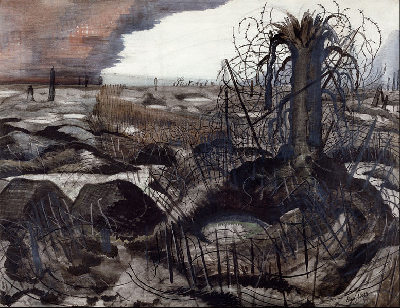
Wire, 1919
 http://www.middlewaysociety.org/wp-content/uploads/2014/03/777px-Nash_Paul_-_Wire_-_Google_Art_Project.jpg
We are making a new world, 1918
 http://41.media.tumblr.com/09b0b52dc80845cd992df64b45003b91/tumblr_nbykatAPgU1siutb5o1_500.jpg
The Menin Road,1919
 http://upload.wikimedia.org/wikipedia/en/5/5d/Nash,_Paul_-_The_Menin_Road_-_Google_Art_Project.jpg
Paul Nash's paintings are similar to Edward Bawden's illustration's in my opinion because they have both developed illustrations of war time environments, in which they have both showed the different lighting and shadow effects within the environments and some of there illustrations involve people as a part of the environment, where they both have produced illustrations in showing the detail of the environment like the shapes, objects and colours within the environments.
Some of Paul Nash's illustrations are lighter than Bawden's where like Ravilious, Nash has used a wider and bright range of colours, like some areas of the sky in Nash's illustrations are a lot of brighter than the colours Bawden used, Nash's work tents to be more about the landscape environments, while Bawden tented to produce illustrations of buildings, people as well as the surrounding environments, which I believe makes Bawden's images more interesting in the way he's including a structure and also adding a surrounding environment.
I do find Paul Nash's painting very interesting in the way he had chosen similar landscapes in his work, where their tents to be wastelands in a way with the feeling of death involved, but I prefer Edward Bawden's illustrations because I like the way he has used good shadow and lighting effect when he has not been using a wide range of colours, I also prefer his use of line to Nash's where I believe bawden's use of line is stronger in showing the outlines of structures, people and other objects within his illustrations.
John Nash the brother of Paul Nash was a painter who focused on landscapes and still life, he was another war artist like Bawden where he served as an official war artist with the rank of Captain in 1940 than promoted to acting Major in 1943, John Nash like his brother focused a lot on landscapes imagery, creating a lot of landscapes paintings.
Over The Top, 1918
 http://upload.wikimedia.org/wikipedia/en/5/5b/Nash,_John_(RA)_-_'Over_The_Top'._1st_Artists'_Rifles_at_Marcoing,_30th_December_1917_-_Google_Art_Project.jpg
Oppy Wood, 1917
 http://archive.iwm.org.uk/upload/package/95/collections/art/john-nash.html
The Cornfield, 1918
 http://upload.wikimedia.org/wikipedia/en/thumb/c/c4/Thecornfield.jpg/220px-Thecornfield.jpg
Like Paul Nash and Eric Ravilious I do see similarities between John Nash's and Bawden's own illustrations, where they both had produced land scape images based around the theme of the world wars where they both have involved soldiers in there work, showing there movements and what they were doing during different events of the wars, like Bawden's In an Air Raid Shelter, Dunkirk Bombs are dropping shows soldiers taking cover from air raid bombings and John Nash's over the top oil painting shows soldiers advancing on the battle field.
There are a number of differences between the two artist work, where John Nash mostly work with oil paints when Bawden work mostly with water colours, John Nash's work like the other two artists is a lot more colourful, than Bawden's paintings, John Nash those tent to show some shadow within his paintings,
In my opinion Bawden's use of shadow is far greater with his darker use of colours, Bawden tent's to use a lot more outline in his work than John Nash in terms of showing the soldiers positioning, therefore showing there body language from his painting In an Air Raid Shelter, Dunkirk Bombs are dropping.
Out of the two artist I like Bawden's illustrations better than John Nash's work mostly because I like the dark nature of Bawden's work, while John Nash's work tent's to be quiet colourful which I do like, because I believe he has shown the true nature of what he see's well, but again Bawden for me has created illustrations of structures also showing natural soundings around the structures like St Paul,s he has added a house that was blocking part of the view of the structure, which in my opinion has given Bawden the edge in terms of showing what he see's in good detail, where I believe his use of outline improves the quality of his illustrations.
Louis Wain was an English illustrator who like Bawden created cat illustrations, where Wain was well known for his cat illustrations, Wain also created landscape and other animal illustrations, where Wain created dog illustrations too. Some of Wain's work is very colourful, where he tented to use colourful patterns in some of his illustrations of cats.
Cats on the green
 http://s2.hubimg.com/u/2104805_f520.jpg
Colourful cat
 http://s1.hubimg.com/u/2104910_f520.jpg
Cat's Christmas
 http://s2.hubimg.com/u/2579093_f520.jpg
I do believe Wain's images and Bawden's images of cats, are similar in the way they both have created illustrations based around the same types of animals, where some of there illustrations in my opinion are cheerful and full of life, which they both had created different images of cats in there true nature and in human nature, where they show cats acting like human in some of there illustrations.
Louis Wain's work I believe is more colourful than Bawden's cat images, where he tents to use a colourful pattern for his background for some of his cat illustration like for the colourful cat illustration. Some of Bawden's images of cats tents to lino prints where he has black and white images of cats.
I prefer Bawden's illustrations because I prefer the detailed nature of his cats better, where Bawden has only used black and white in his illustrations to show the body language and details of the cats in his illustrations, I also prefer the black and white images to Wain's coloured images of cats because I like the dark nature of bawden's work to the lighter, colourful nature of Wain's work.
Overall I believe Edward Bawden was right up there with the best illustrators during his life time, due to him being well known to many artist and his work to this day still being displayed in big well known galleries such as the Tate galleries and the Imperial war museum as well as John Nash, Paul Nash and Eric Ravilious war time illustrations, where I believe all there work relate with Bawden's illustrations, where they all created war time illustrations and landscape images.
I believe all three other war time artist had a big influence on
Bawden's development, where Paul Nash taught Bawden at The Royal College of
Art, John Nash I believe would have meet Bawden also helping him develop as
well as Eric Ravilious who became good friends with Bawden working together
influencing each other’s giving each other feedback about their own work,
which is why I believe there work is similar in different ways to Bawden's
illustrations, giving their use of colour, themes and ways of showing different
environments.
Louis Wain had a big influence on Bawden as a young upcoming illustrator,
where Bawden from a young age studied and drew cats based around Wain’s work,
where Bawden would go on to create his own cat illustrations in his later life.
I believe Bawden is best known for his time as an artist and for his cat
illustrations, where a lot of his work was lively, joyful, but I found some of
Bawden’s work to be dark too, but what I mostly liked about his work was the
detail of the surrounding environments in some of his illustration’s, the low
range of colours used like for The Catholic Church, Addis Ababa and finally for
the use of shadow, dark tone used in his work.


_-_'Over_The_Top'._1st_Artists'_Rifles_at_Marcoing,_30th_December_1917_-_Google_Art_Project.jpg)